
Cost sharing client
Client: Knew Health
Goal: User Dashboard Design
Role: Lead UX/UI Designer
UI/UX Design · Figma · Dashboard Design · Digital Product Design
I designed a client-facing dashboard for Knew Health in Figma, focusing on creating an intuitive, user-friendly experience that makes information easy to access and navigate. Through thoughtful UI design, clear information hierarchy, and a cohesive visual system, I developed a digital experience tailored to the needs of Knew Health’s clients.
Challenge
Create a user-friendly digital experience that gives Knew Health clients a centralized, accessible way to interact with the brand’s services.
Approach
I designed a client-facing dashboard in Figma, focusing on intuitive navigation, clear information hierarchy, and a cohesive visual experience aligned with the brand. I translated client needs into thoughtful interface designs that balance functionality with visual clarity.
Outcome
A thoughtfully designed dashboard concept that establishes a foundation for a more seamless client experience, making information easier to navigate and the digital experience more cohesive.
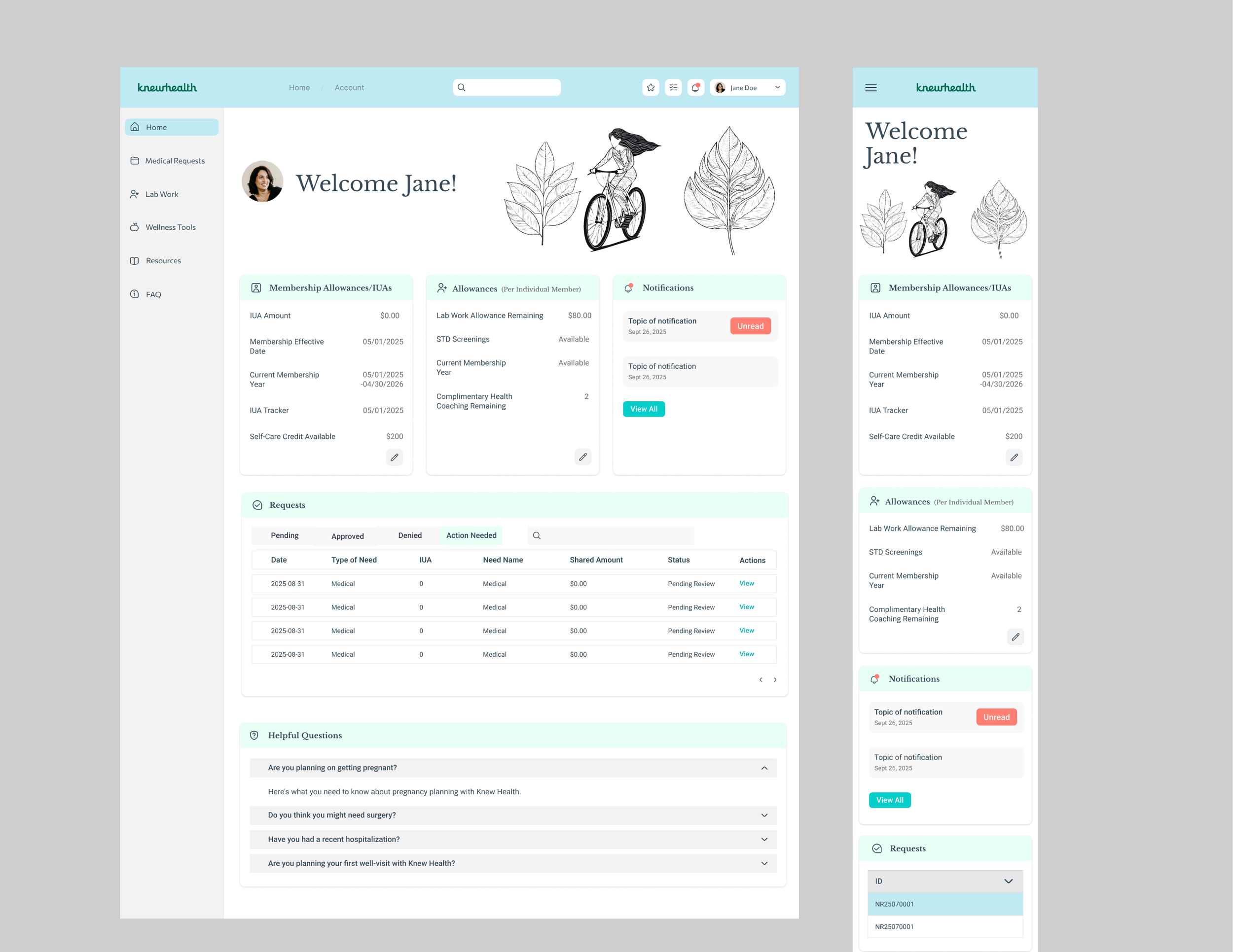
Desktop + Mobile designs
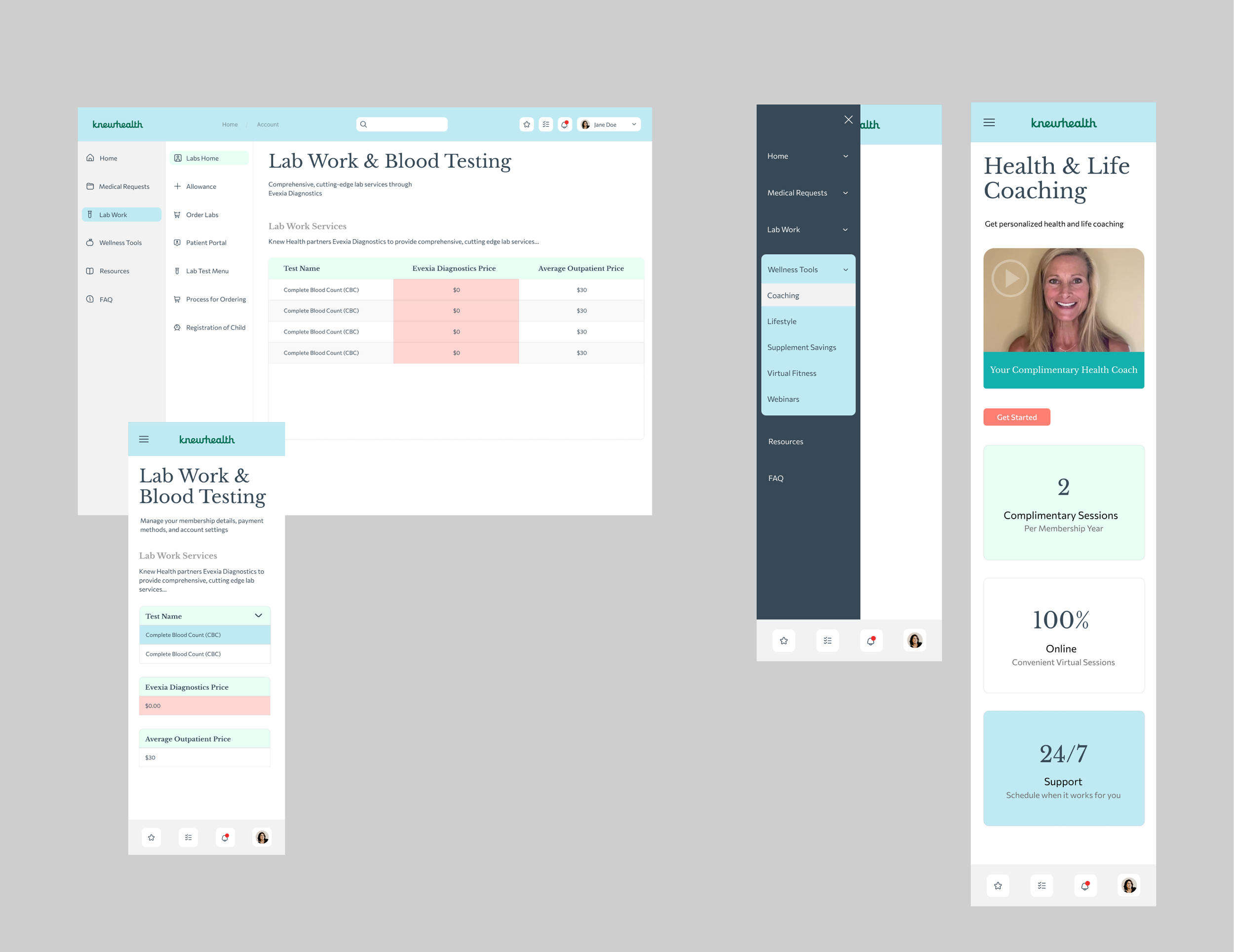
Cost sharing client
Client: Knew Health
Goal: Homepage Redesign
Role: Lead Web Designer
Brand Identity · Art Direction · Digital Design
Knew Health is a medical cost sharing company, basically an alternative solution to healthcare. My role was to update their homepage and branding. We worked on improving their mobile experience, not only aesthetically, but the previous site used overly complicated code that was very hard to make changes to. I worked to look for a developer we could trust to meet our milestones.
The Challenge
Making complex cost-sharing information easier to understand through a clear, approachable, and cohesive visual identity.
The Approach
I developed a visual direction focused on clarity, accessibility, and consistency, translating a complex service into a more approachable brand experience. Through thoughtful design choices and cohesive visual communication, the goal was to make information easier to navigate and connect with.
The Outcome
A unified visual language designed to communicate the service clearly and create a more accessible, recognizable brand experience.


I continue to work with Knew Health, we are currently working on a redesign to create a custom set of illustrations that feel more branded. Their demographic is on the younger side, so we feel this can lend to a more fun style, and lead to greater brand recognition.

In the second iteration of the website we will add more illustrations, based on user testing and feedback from stakeholders that they want their branding to display a more fun attitude.
We are currently still working on these…TBD!